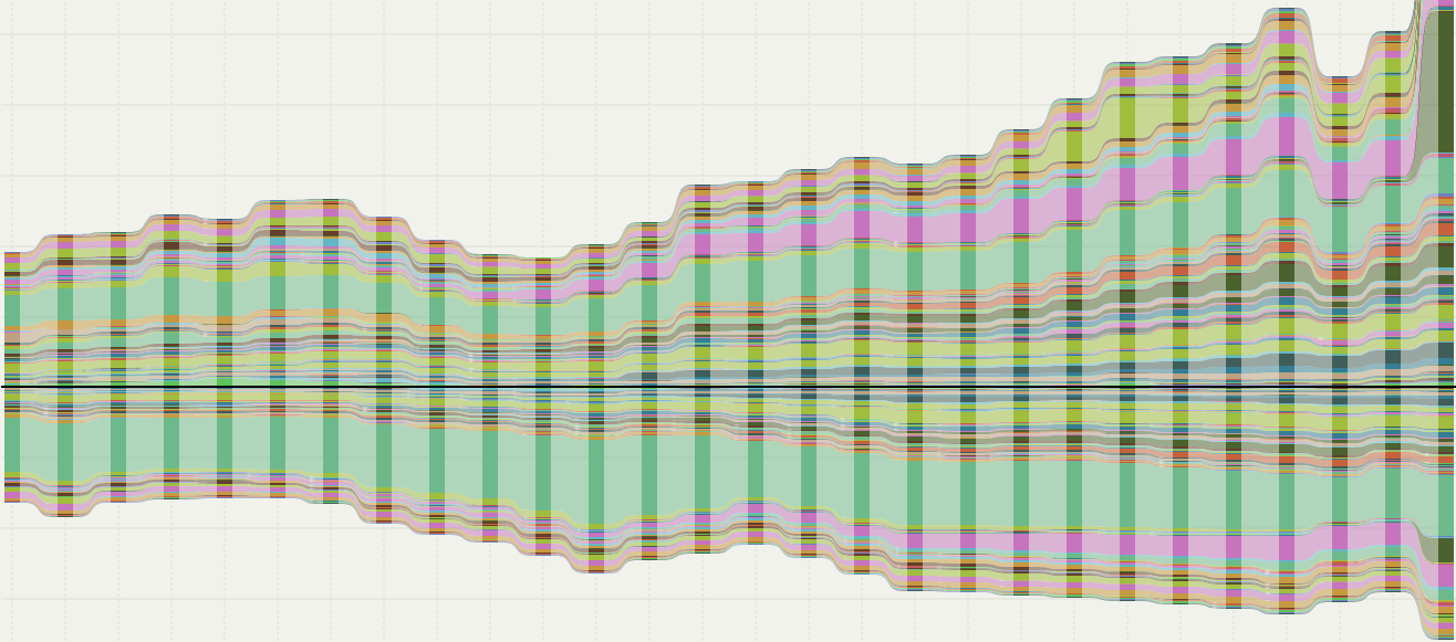
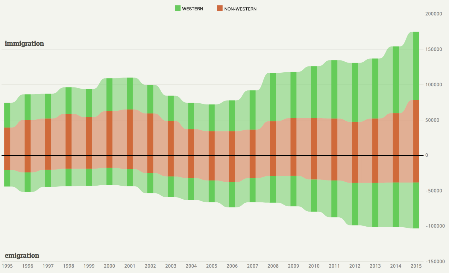
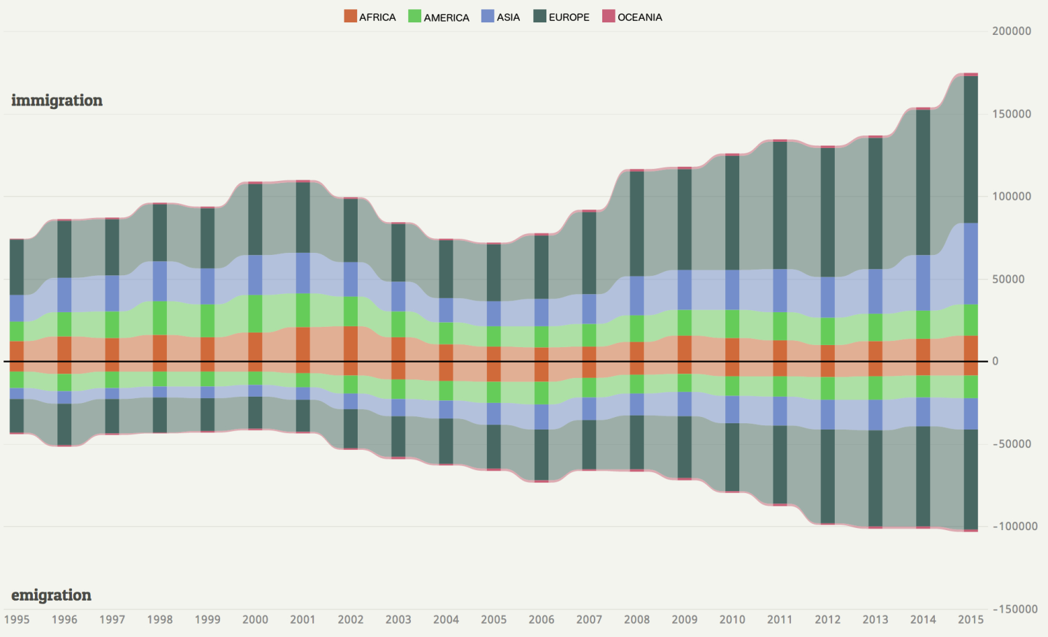
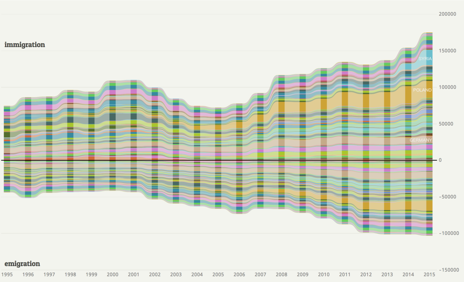
This self-initiated interactive chart visualises migration in the Netherlands between 1995 and 2022, based on migrants’ country of birth. The chart has two parts: the positive vertical axis shows immigration, while the negative axis shows emigration. Each coloured layer represents a different country of birth, arranged alphabetically.
Hovering over a layer reveals more details about migration from the selected country. The visualisation makes it clear that, alongside immigration, there is a substantial flow of emigrants each year. Some return to their country of birth, while many are Dutch citizens settling abroad. Between 2003 and 2007, net migration was negative — meaning more people left the Netherlands than arrived.
The data is sourced from CBS Statistics Netherlands
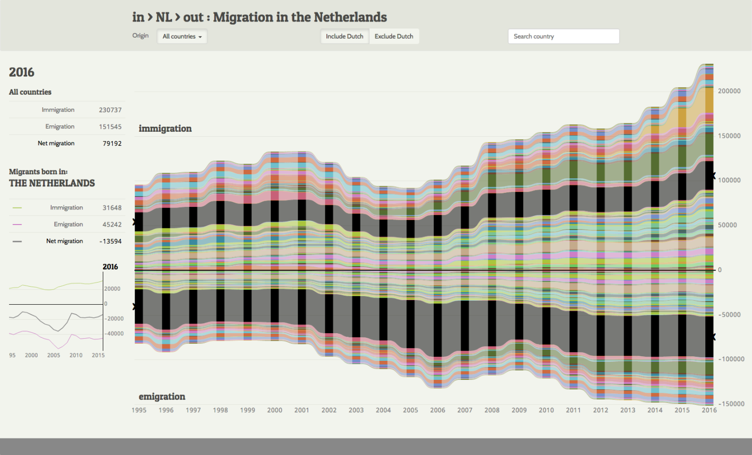
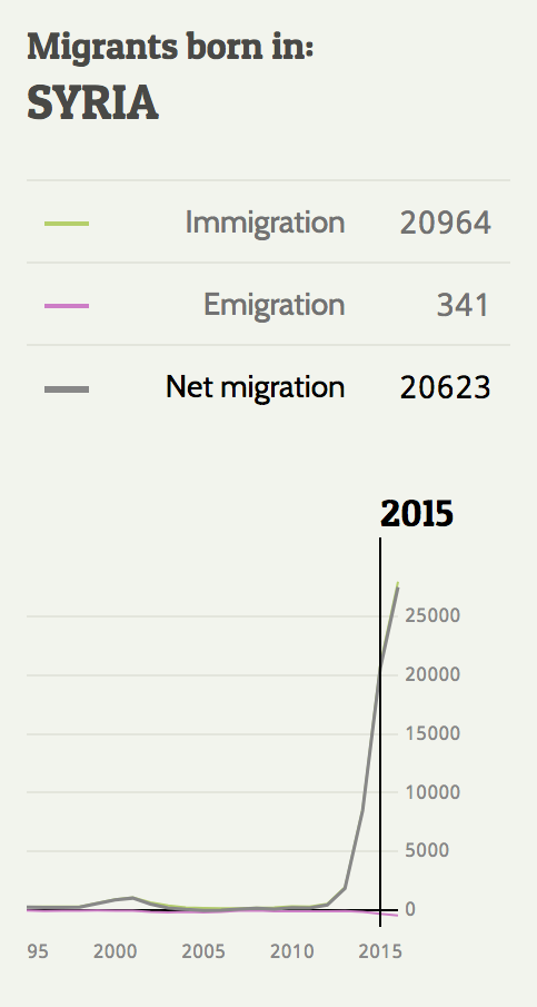
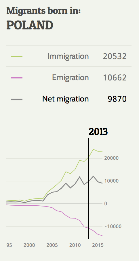
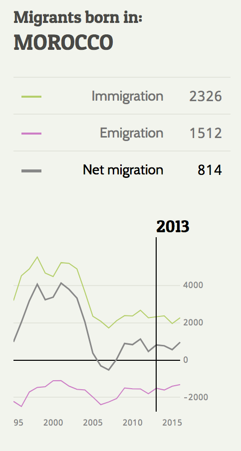
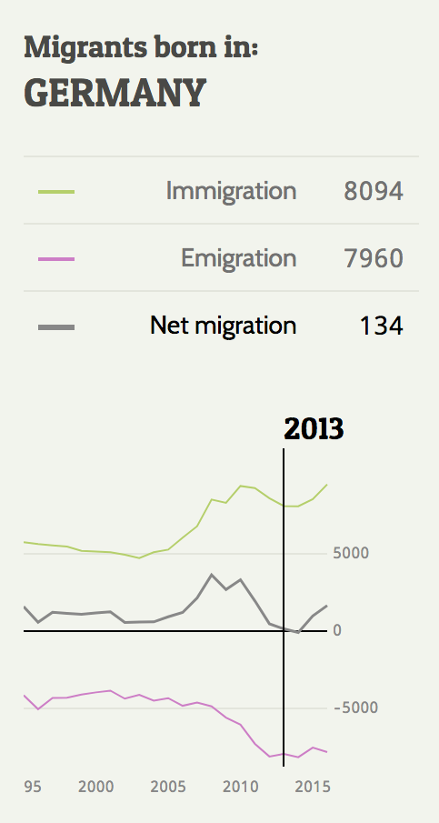
Line charts appear when hovering over a country, providing detailed migration data for that country. They show immigration, emigration, and the net difference between the two.